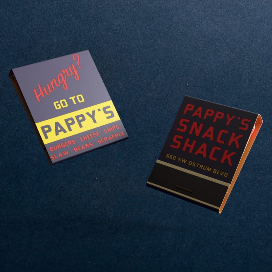
About Contingent

Contingent, created from our Matchbook Collection, is a solid slab serif with a unique combination of traditional shapes and tight-radius curved corners.

The Inspiration

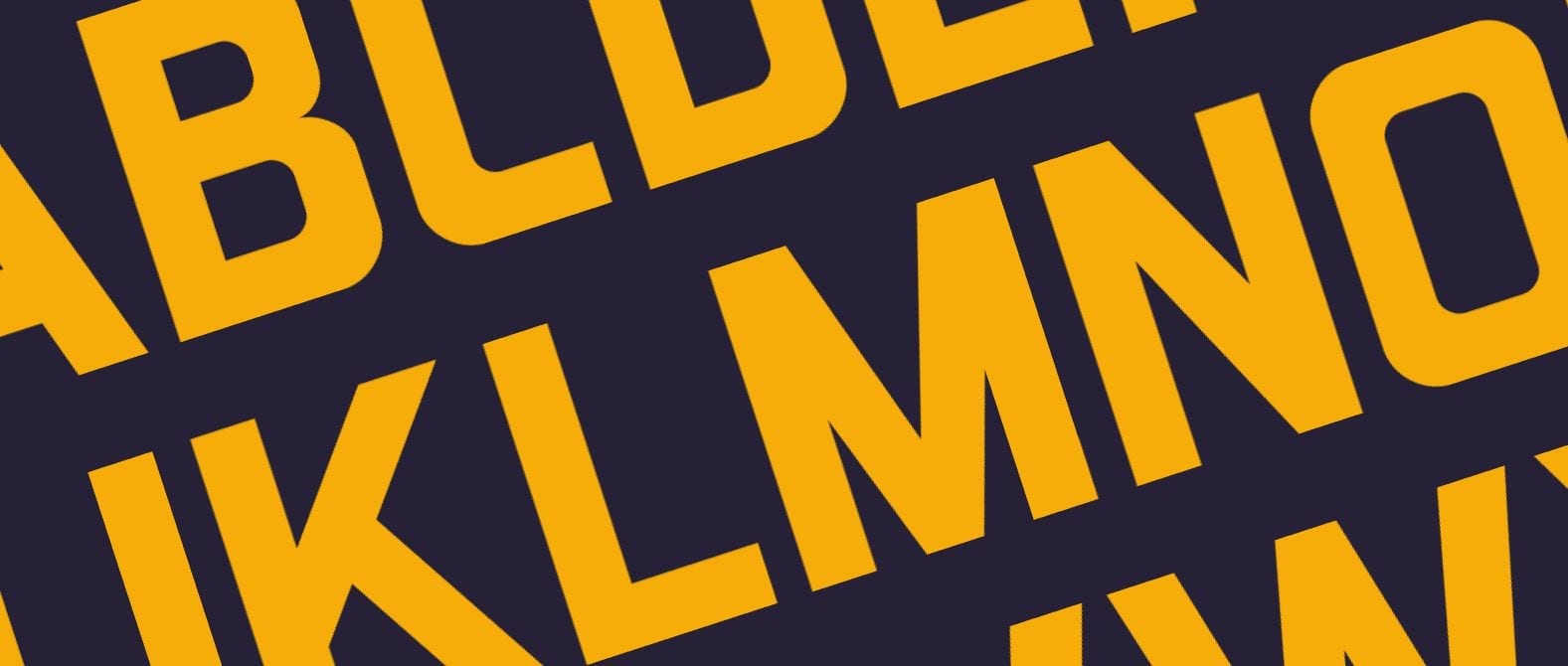
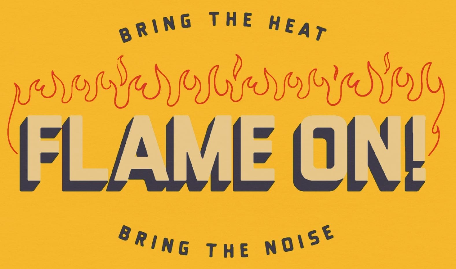
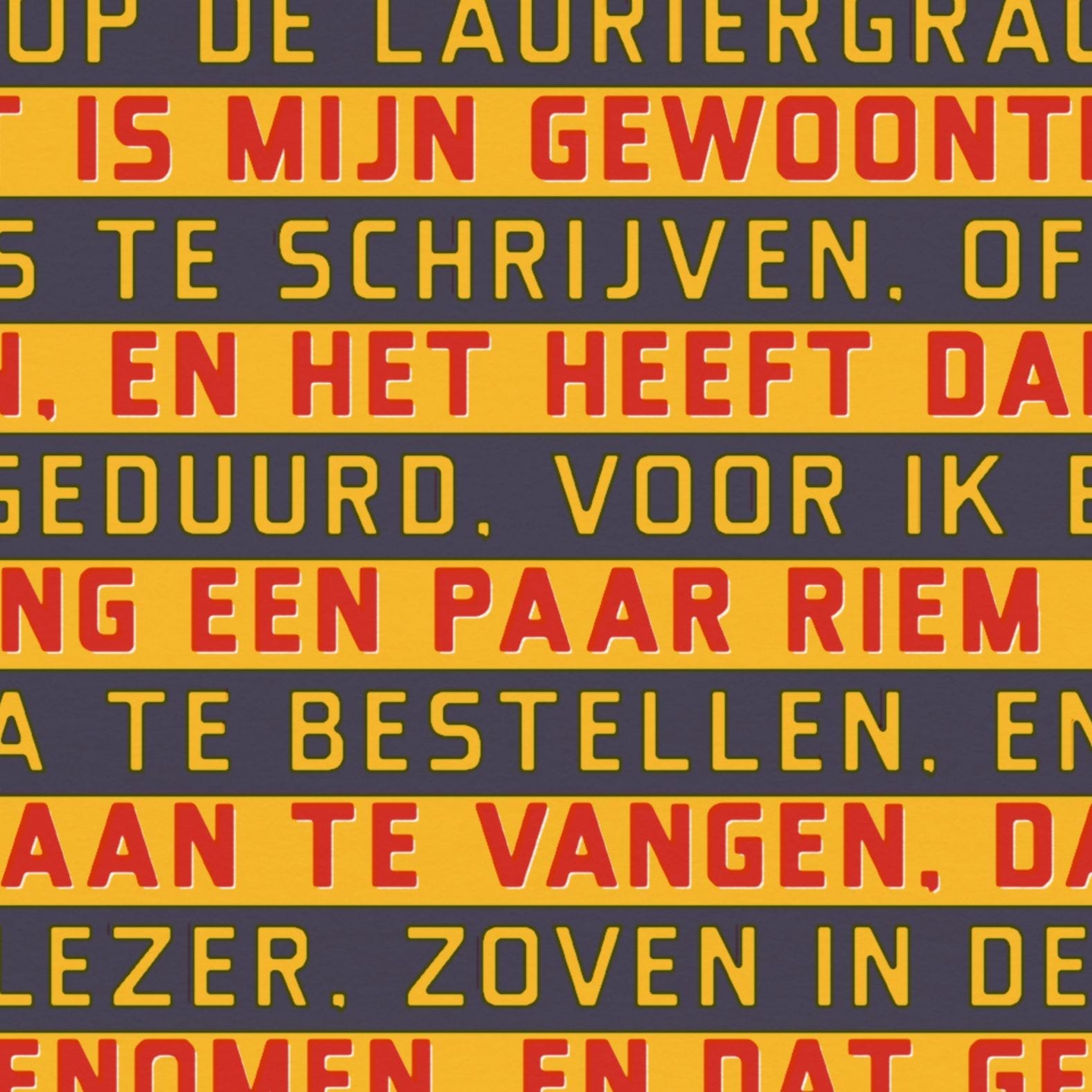
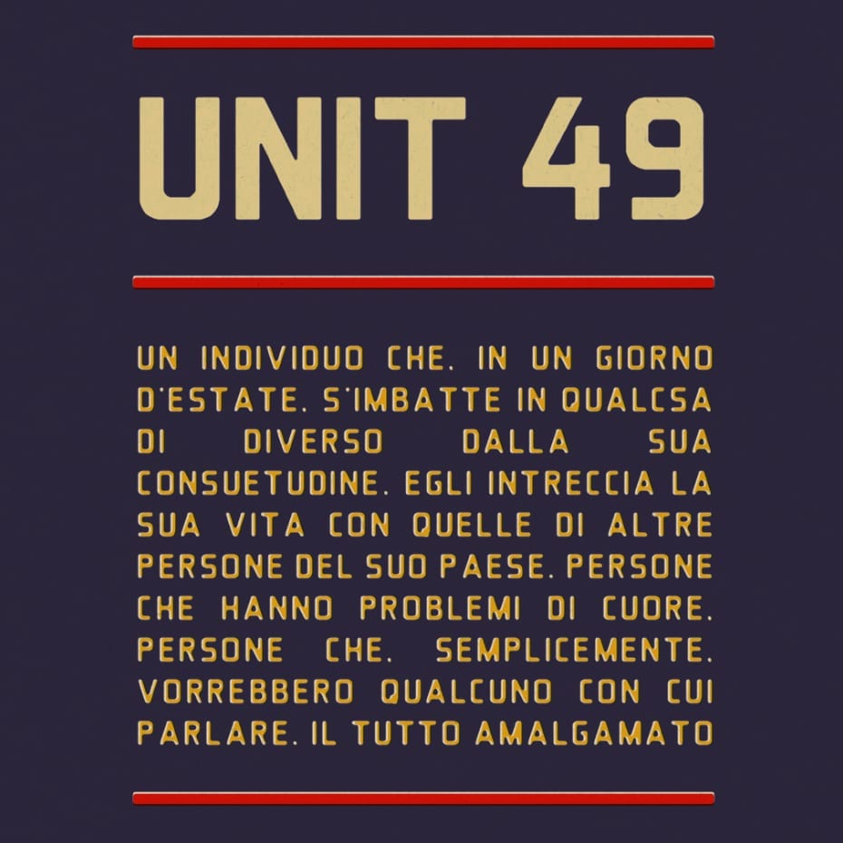
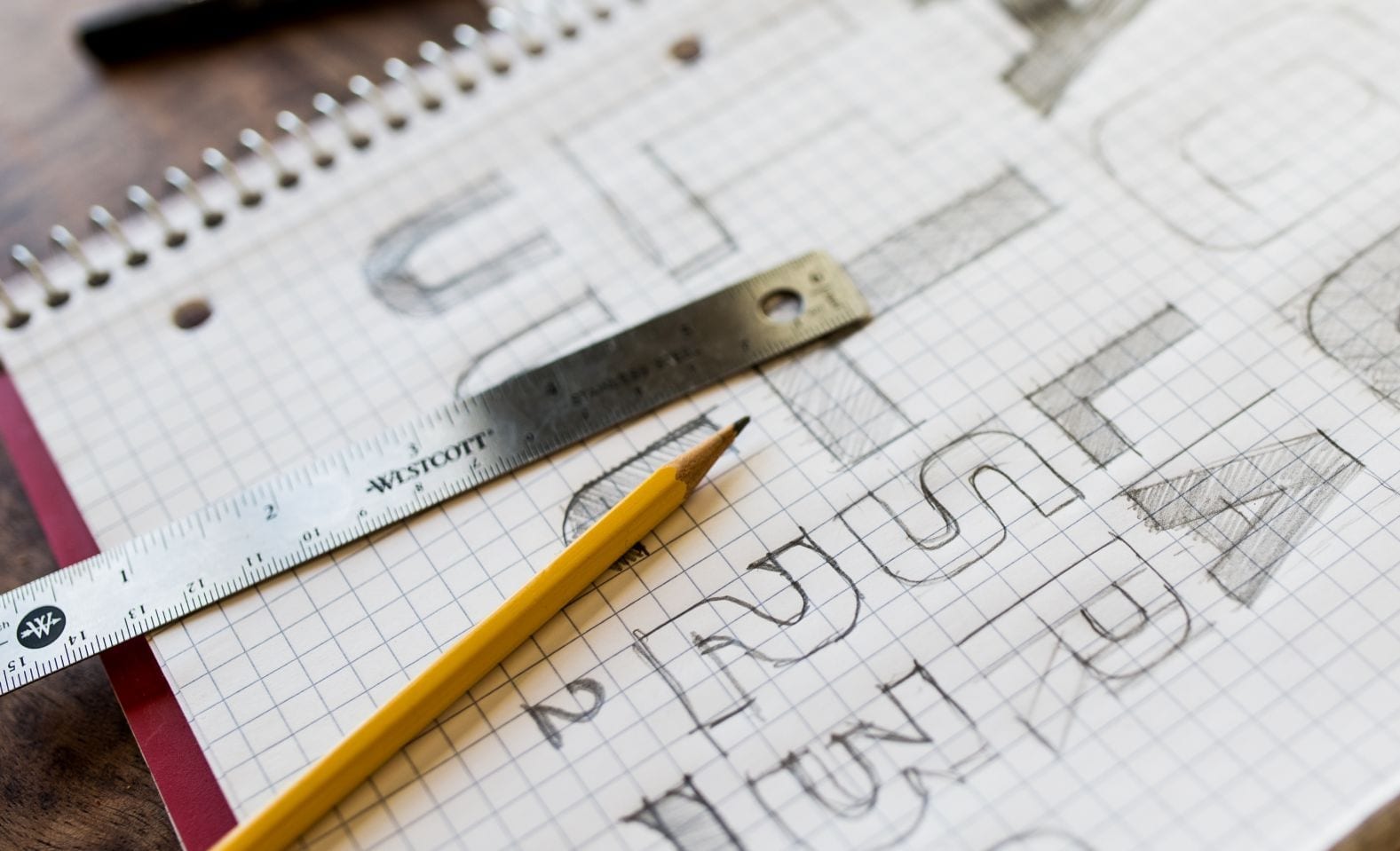
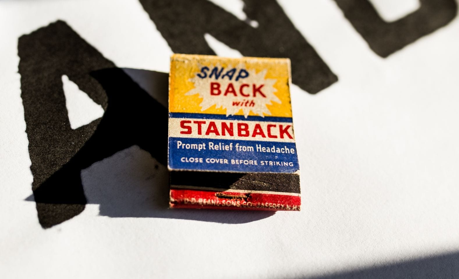
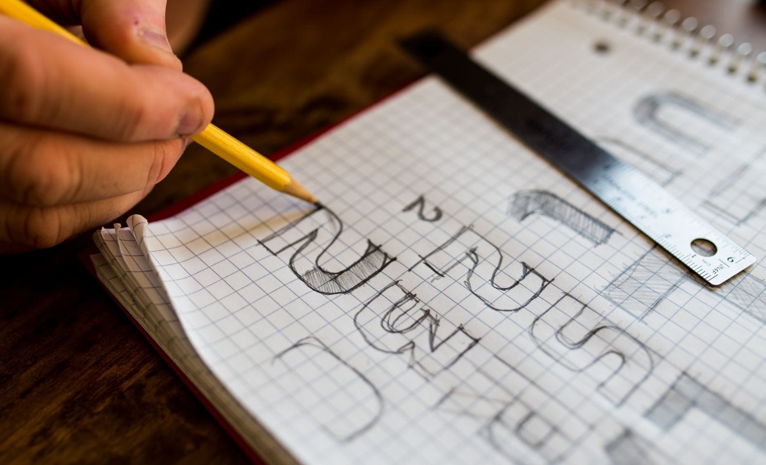
While inspiration came from the Matchbook Collection as a whole, we derived the typeface from lettering we found appealing. Type on the matchbooks comes from one of two places — physical metal type that was set and printed (which was usually a standard typeface like Futura, and not worth emulating) or hand-drawn type that was created as part of the matchbook illustration or artwork. Since we were also testing the waters of type creation, an entire discipline unto itself, we chose a solid slab display face over a more intricate serif or cursive type. While there are literally thousands of fonts in the world, the first step was to ensure we were making something individual. There are plenty of other tall/condensed thick slab typefaces, but our chosen sample had an appealing and unique combination of traditional shapes and tight-radius curved corners that we didn’t find in related available typefaces.

The Process

We made high resolution scans of the matchbook we’d be using and drew the available characters (A, B, C, K, N and S) on graph paper. The drawings were refined to fit a grid, and the basic forms of the other letters and numbers began to reveal themselves. Letterforms were tested in the context of words, mostly for width and differentiation: An “M” can be too wide or too narrow. Is a “C” just an “O” with a cut? And how does a “G” distinguish itself? After discussion and approval, the drawings were scanned back into the computer and traced in Illustrator for further refinement — vertical, horizontal, and diagonal strokes, as well as major and minor curve radii were standardized in this phase. Decisions that were made in drawing were further revised the more we saw the characters interacting onscreen. A few necessary punctuation characters were derived at this point and the full set of 25 characters + 0-9 + punctuation were saved, and variations for future releases started to take shape — thinner weights, drop shadows, rough textures, pointer corners, etc. came from this process. The vector characters were then imported into a type foundry program where technical specifications about how the type operates were determined. How much space surrounds each character, where does the baseline of each character sit, what are the individual relationships between specific pairs, and how does each shape relate to any other shape. The typeface was exported, tested, refined, and tested again until it was functional.